Brand identity & illustration · 2026
Hoji Tea Studios
Exploring the visual identity of Hojicha through mascot development, hand-drawn logo studies, traditional brush artwork, and brand strategy for a local tea studio.
Explore the artwork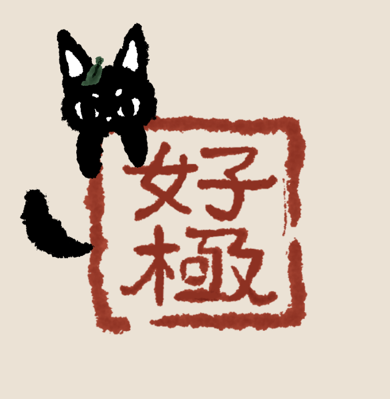
From the sketchbookArt by Malissa Chen
- Project
- Hoji Tea Studios
- My role
- Creative Director & Brand Consultant
- Focus
- Brand identity & character design
- Timeline
- May 2026 — Present
01 / Overview
Brand Concept
Hojicha has two forms and one identity. Hoji and Cha are the two halves of the name; neither is complete without the other.
The character brief
The brief called for a cozy, nostalgic mood with a little melancholy, like sitting beside a rainy window with a warm drink.
My contribution
As Creative Director & Brand Consultant, I translate the character brief into illustrated form studies and logo explorations, using shape, expression, and shared details to connect the two identities.
02 / Character exploration
Mascot Designing
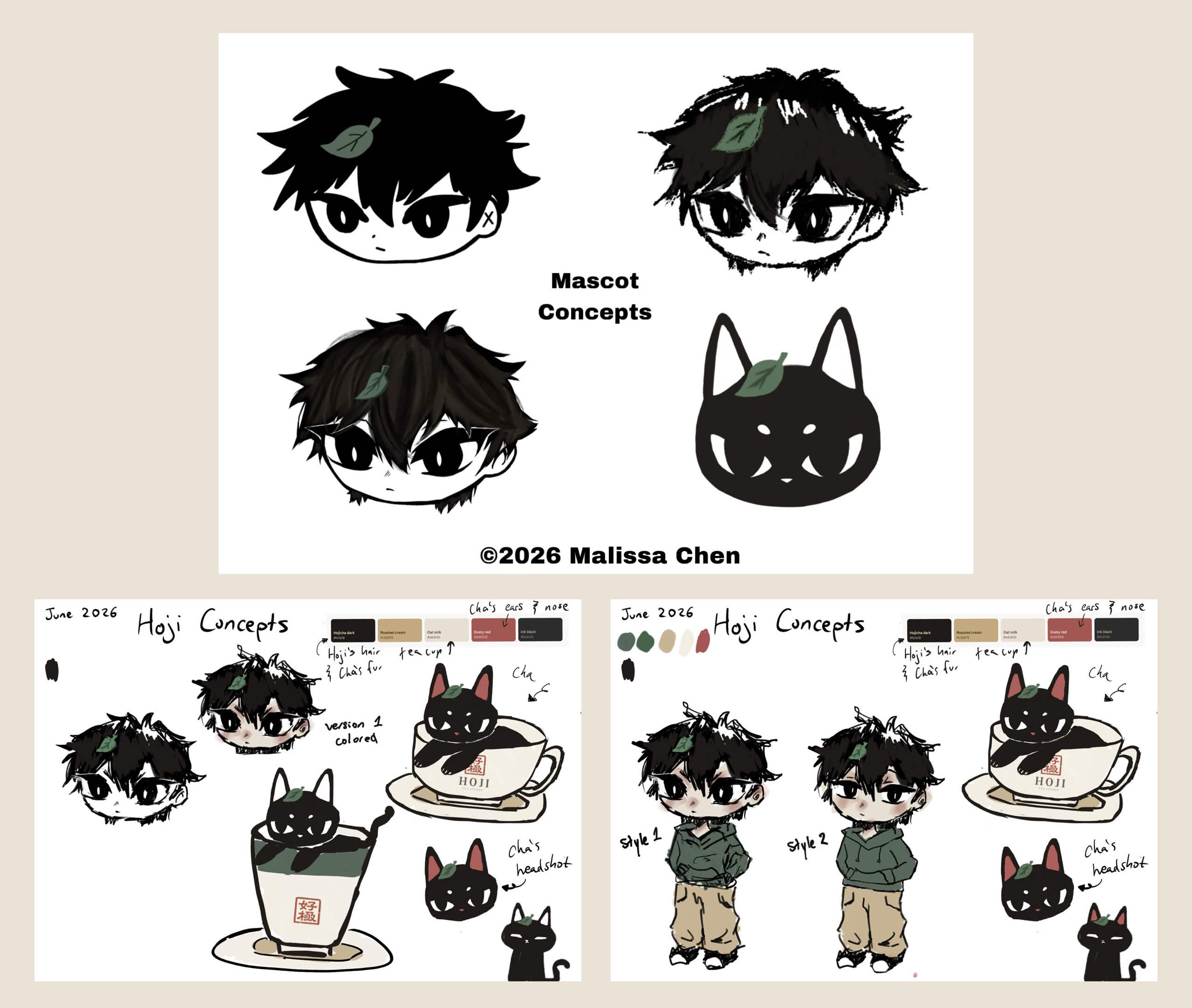
I designed the mascots with a care-free, hand-sketched art style. The mascot concepts prioritize loose sketchy linework and expression to highlight the playful charm of the character's personality.
Hoji · The boy form
The human mascot is depicted as a young boy with messy dark hair, has a soft round face with sharp cat-like eyes paired with loose clothing.
Cha · The cat form
A fluffy black cat with a round silhouette, relaxed posture, and the same sleepy eyes. Quiet and observant, he watches from windowsills, bookshelves, and quiet corners.
The clues that connect them
Matching expressions, similar proportions, earthy colors, and a recurring tea leaf reveal the shared spirit. The leaf should feel subtle and magical rather than overtly supernatural.
03 / Logo exploration
A mark with
character.
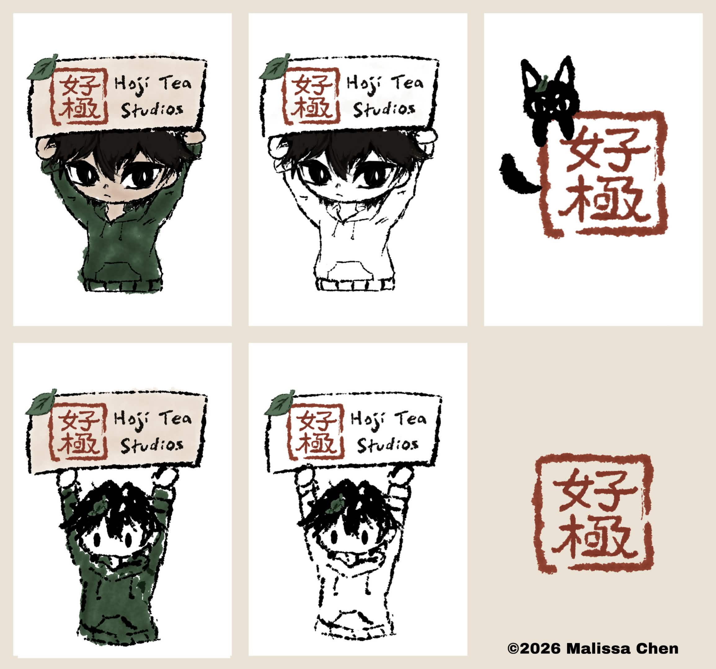
Each logo study explores one of Hojicha's alternate forms: Hoji holding the studio name, or Cha beside the red stamp. Handwritten lettering, color and linework variations, and the recurring leaf carry the spirit into the brand identity.
04 / Business card illustration
The Aesthetic
The studio requested a traditional Chinese painting style for the business-card artwork. I developed a revised landscape illustration, inspired from their original design through revisioned sketches to the final piece.
Step 01
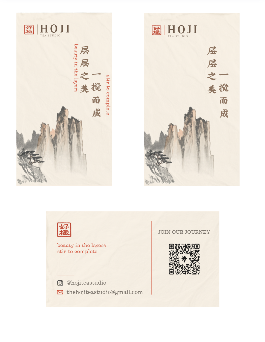
The original card design
The studio’s original business card established the vision for a traditional chinese landscape aesthetic, pairing ink-style mountains and trees with their branding. However, because the original artwork was uncredited internet stock, it presented copyright risks. My goal was to create an original, custom illustration that captured the same classical style without legal conflict.
Step 02
Finding the composition
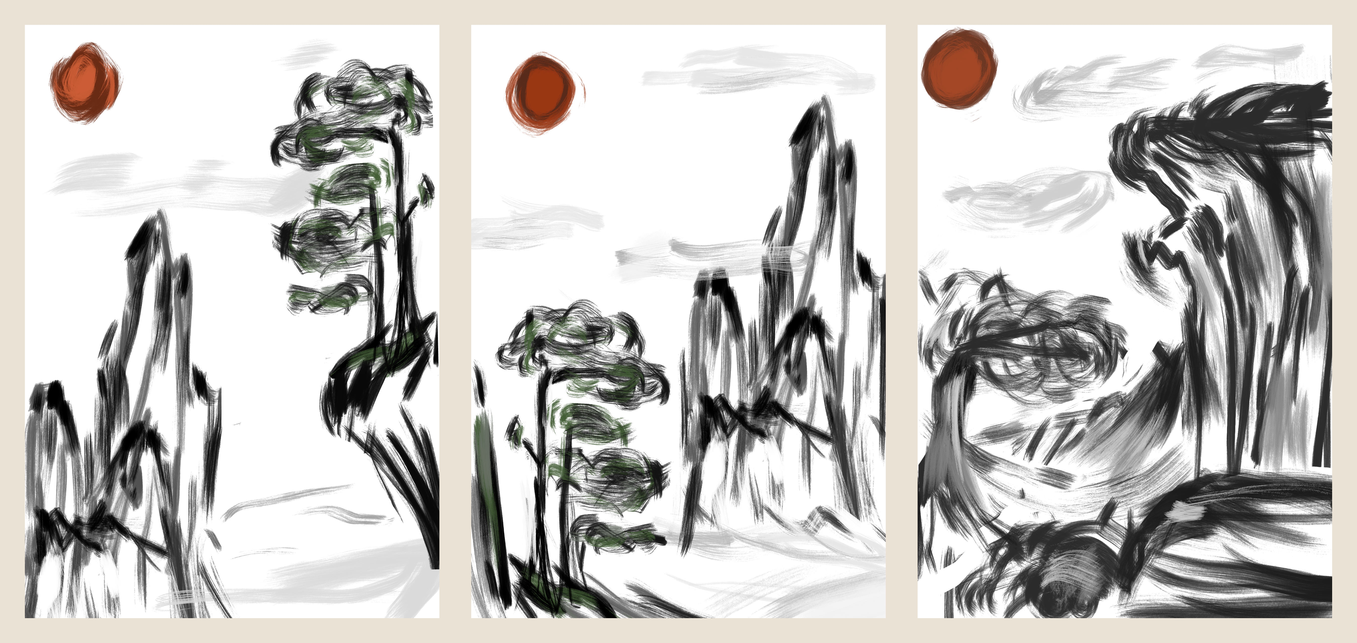
I sketched three arrangements of mountains and trees to explore their placement, scale, and the open space around them before refining the illustration.
Step 03
The final revised artwork
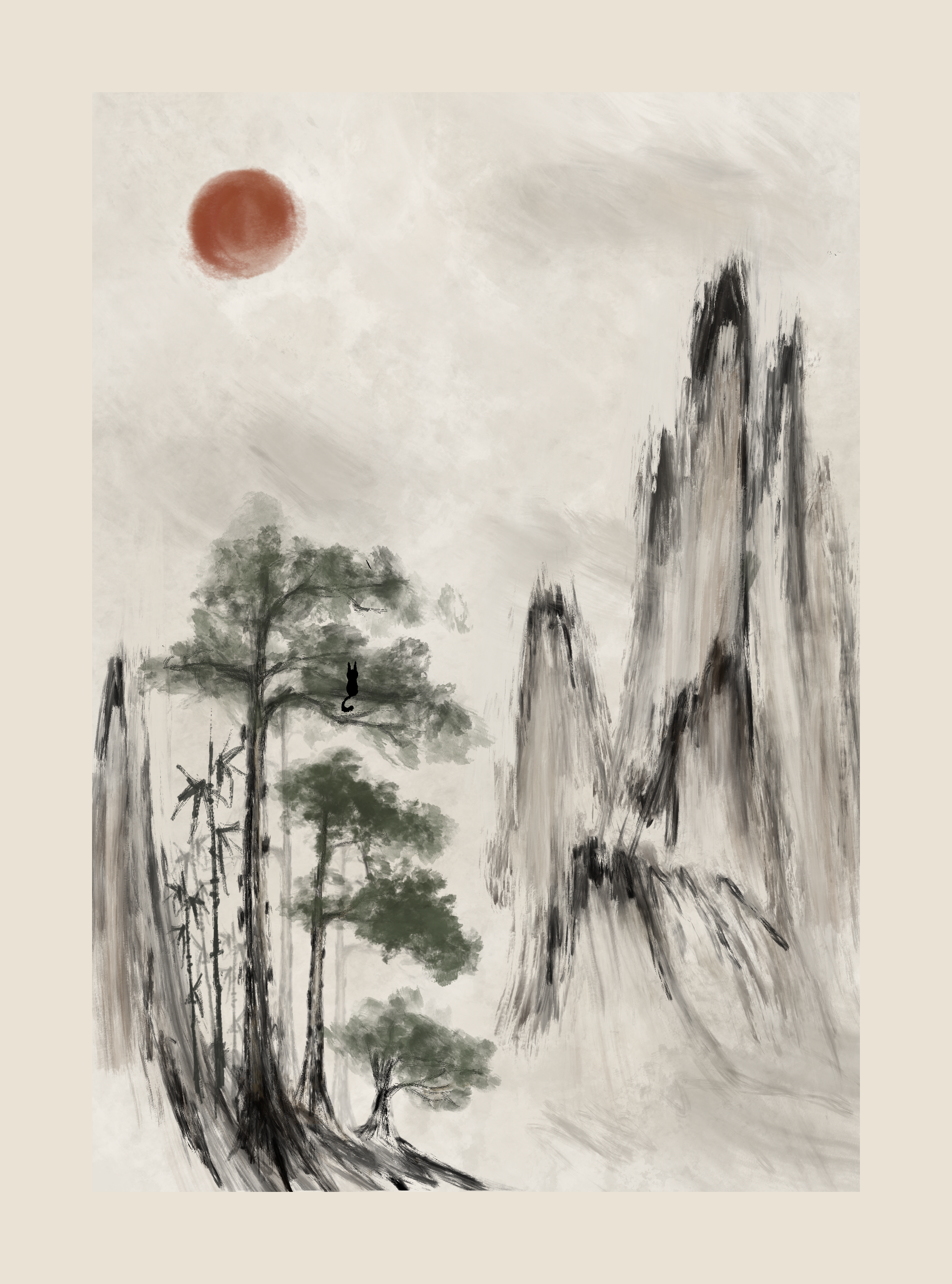
I refined the landscape with soft brush textures, misty mountains, muted green trees, and a warm red sun. Cha sits quietly in the branches, bringing the spirit’s observant presence into the artwork for the business card.
05 / Visual direction
The color palette
The visual direction pairs soft storybook illustration and a warm indie café atmosphere with the rounded, slightly sculptural feel of designer toys. Simplified features and a muted earthy palette keep both forms gentle and familiar.
The character is intended for stickers, charms, plushies, figurines, packaging illustrations, and story-driven branding. These studies explore that direction through the two forms of one quiet spirit.
Selected artwork © 2026 Malissa Chen · Studio reference credited above
Back to top ↑